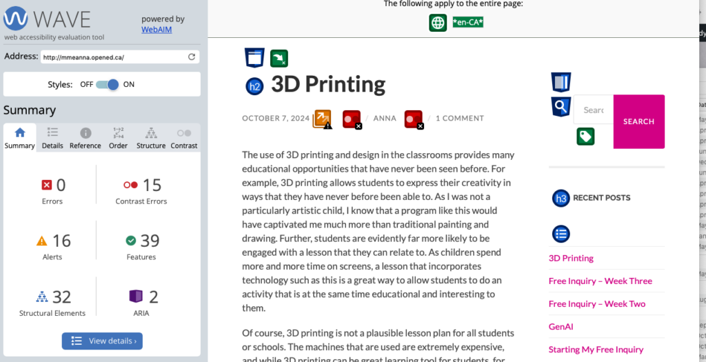
After running my blog through the WAVE Web Accessibility Evaluation Tool, I was pleasantly surprised that my website did not have too many accessibility issues. When I pasted my blog link into WAVE, it went line by line, link by link, and colour by colour to determine any accessibility issues I might have.

Although this may look like a lot of issues, the only actual accessibility problem is the contrast. The grey text on the white background provides a very low contrast, which can be difficult to see. I will of course look into changing this as soon as I can.
This is an aspect of digital accessibility that I had never considered. I have always had excellent vision, especially in relation to colours, and have never had an issue discerning one colour from another. Now that I know that this can be an issue, as well as how easy it is to mitigate, I will try to provide as much contrast as possible whenever it is applicable.
For my accessible video, I used the video I made at the beginning of the term of my introduction to Rich. I think that this was a good video to use, as I was talking clearly and relatively slowly the entire time. I made it accessible by adding Youtube automated captioning. Surprisingly, the captions were relatively accurate. The only words that I had to update were proper nouns such as “Shawnigan” and “UVIC,” which is to be expected.
The captions on the video may have to be turned on manually.
Hey Anna, Great blog post!
You do a wonderful job of explaining the use of WAVE and how it helped you to create a more user-friendly site. I also had to change my colours and it wasn’t something I had really thought off before since I don’t have perfect eyesight but colours aren’t an issue for me. I wonder if adding headings could help those who are skimming your page for info or those who use text readers.